Comparison of Errors and Extension Report Elements
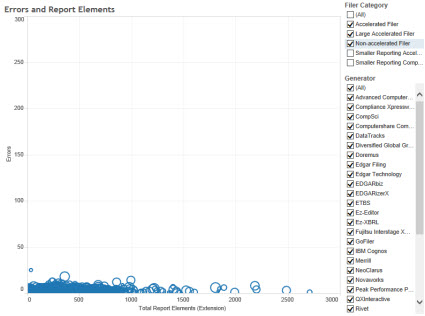
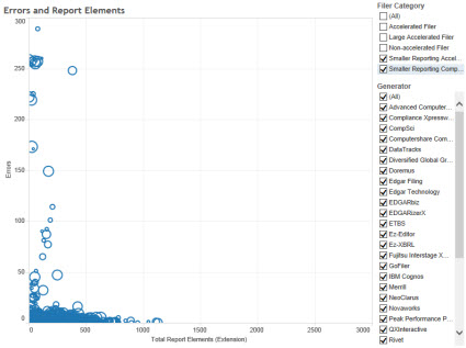
Man, this is incredibly interesting and useful stuff. This visualization "Errors and Report Elements" tab or "Dashboard 2" shows Errors on the vertical axis and the number of extension report elements on the horizontal axis. The two screen shots below are for LARGER and SMALLER reporting entities. You can select which groups you want to see. The really interesting thing is to look by Generator!
This is a visualization of errors and extension concepts for larger entities: (fewer errors, more extension report elements)
 (Click to go to visualization)
This is a visualization of errors and extension concepts for smaller entities: (more errors, fewer extension report elements)
 (Click to go to visualization)
Reach your own conclusions.
 Charlie
 Post a Comment
 View Printer Friendly Version
 Email Article to Friend
Reader Comments