Visual Comparison of Extensions at Report Element Category Level
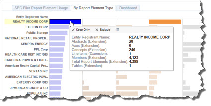
The SEC is complaining about extensions. Just looking at the total number of extension elements only tells part of the story. For example, the company who created the most extension report elements, Realty Income Corp, had 4,399 extensions, but 4,123 of them where [Member]s. Those [Member]s seem perfectly reasonable to me. (You can go to their filing here, look at the second to the last schedule in the Notes Detail)
So, one really needs to understand which category of report element is being extended. This visualization which I created shows that detail.
 (Click to go to Tableau Visualization)
Here is the raw data in Excel.
Isn't Tableau useful? I think so. Slice, dice, sort, search, filter to your hearts content. Find anything interesting be sure to let me know.
 Charlie
in Becoming an XBRL Master Craftsman
|
Charlie
in Becoming an XBRL Master Craftsman
|
 Post a Comment
 View Printer Friendly Version
 Email Article to Friend
Reader Comments