BLOG: Digital Financial Reporting
This is a blog for information relating to digital financial reporting. This blog is basically my "lab notebook" for experimenting and learning about XBRL-based digital financial reporting. This is my brain storming platform. This is where I think out loud (i.e. publicly) about digital financial reporting. This information is for innovators and early adopters who are ushering in a new era of accounting, reporting, auditing, and analysis in a digital environment.
Much of the information contained in this blog is synthasized, summarized, condensed, better organized and articulated in my book XBRL for Dummies and in the chapters of Intelligent XBRL-based Digital Financial Reporting. If you have any questions, feel free to contact me.
Entries from June 28, 2009 - July 4, 2009
Notion of Flow
This blog entry builds upon this blog entry which articulates the idea of an interactive information hypercube. You should also take a look at this blog entry which discusses shape.
If you look at this interactive information hypercube viewer, look at the left hand pane. You will see the bold heading "Flow of Report". Below that you see a list of components of the report:
- Sales Analysis
- Accounting Policies
- Property, Plant and Equipment; by Component
- Property, Plant, and Equipment; Movements
- Director Compensation
The flow organizes the different hypercubes into the order the creator of the instance document containing the information wants the user to use that information.
There is no standard way to express the flow information within an XBRL taxonomy. So, I created my own way which is 100% XBRL compliant. This is not to say that it is standard. Sure, an XBRL taxonomy tool can read the information, but to do anything with it which to help you render the flow information the application would have to understand that flow information.
The way I did this was to organize each hypercube under a special network which specifically articulates the flow. For example take a look at the different hypercubes from the exampleshown on the "Notion of Shape" blog entry (see above). It looks like this (within the UBmatrix Taxonomy Designer application):
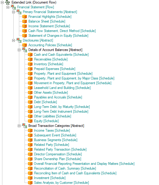
This is what amounts to a special meta pattern which articulates the flow as an organization of hypercubes with some "helper" abstract concepts to provide some hierarchy and therefore levels within the flow organization. All the line items marked "[Schedule]" are hypercubes in the XBRL taxonomy.
You want to change the flow? No worries. All you need to do is edit the XBRL taxonomy, changing the order of the hypercubes and you change the order of the way you look at the report.
So, that is what I call flow; it is simply the order that you want to see the information from an XBRL instance, articulated as a structure within an XBRL taxonomy. Change that flow by changing the taxonomy.
 Charlie
in Flow, Modeling Business Information Using XBRL, XBRL General Information
|
Charlie
in Flow, Modeling Business Information Using XBRL, XBRL General Information
|
 1 Comment
|
1 Comment
|  Email
|
Email
|  Print
Print
Notion of Shape
This blog entry builds upon this blog entry which articulates the idea of an interactive information hypercube.
If you look at this interactive information hypercube viewer, flipping through the different hypercubes listed on the left hand side, you will notice that the different hypercubes have different "shapes".
What I mean by shape is the dimensions which the hypercube uses. Look at the columns of each graphic and you will note that they are different.
If you look at, say, a financial statement, you will notice as I mentioned in the blog entry at the beginning of this blog entry, that statement can be broken down into a number of different hypercubes. Each of those hypercubes have different shapes. This is another way of saying that a financial statement could not be expressed by only one hypercube.
Another example will make this even more clear. Take a look at this Excel spreadsheet. (It is a ZIP file containing a spreadsheet actually) The spreadsheet is a collection of Excel pivot tables. There are two sheets for each pivot table. One sheet contains data for the pivot table, the other contains the actual pivot table. Each pivot table is equivalent to a hypercube. If you go through the different sheets you will begin to see that the dimensions of the information are different. It could be the case that a number of the columns are the same, but remember that another dimension at play here are the primary items or the line items of the hypercube. These are the rows of the spreadsheet.
You can see this even more clearly if you take a look at this example financial statement and then you compare that to this PDF which basically takes the pivot tables from the Excel sheet above and lays them out in the same order of the "paper" financial statement. The information is the same, the presentation is a little different as I tried to get the Excel pivot tables to represent the information from the financial statement as best as I could and as similar to the "paper" format as possible.
Again, the point here is that a financial statement is comprised of a number of hypercubes and those hypercubes have different shapes.
The next point which I will make is that of flow. I will go into that in my next blog entry.
Charlie
in Modeling Business Information Using XBRL, Shape, XBRL General Information
|
Post a Comment
| Email
| Print

