BLOG: Digital Financial Reporting
This is a blog for information relating to digital financial reporting. This blog is basically my "lab notebook" for experimenting and learning about XBRL-based digital financial reporting. This is my brain storming platform. This is where I think out loud (i.e. publicly) about digital financial reporting. This information is for innovators and early adopters who are ushering in a new era of accounting, reporting, auditing, and analysis in a digital environment.
Much of the information contained in this blog is synthasized, summarized, condensed, better organized and articulated in my book XBRL for Dummies and in the chapters of Intelligent XBRL-based Digital Financial Reporting. If you have any questions, feel free to contact me.
Entries from June 1, 2009 - June 30, 2009
Notion of Flow
This blog entry builds upon this blog entry which articulates the idea of an interactive information hypercube. You should also take a look at this blog entry which discusses shape.
If you look at this interactive information hypercube viewer, look at the left hand pane. You will see the bold heading "Flow of Report". Below that you see a list of components of the report:
- Sales Analysis
- Accounting Policies
- Property, Plant and Equipment; by Component
- Property, Plant, and Equipment; Movements
- Director Compensation
The flow organizes the different hypercubes into the order the creator of the instance document containing the information wants the user to use that information.
There is no standard way to express the flow information within an XBRL taxonomy. So, I created my own way which is 100% XBRL compliant. This is not to say that it is standard. Sure, an XBRL taxonomy tool can read the information, but to do anything with it which to help you render the flow information the application would have to understand that flow information.
The way I did this was to organize each hypercube under a special network which specifically articulates the flow. For example take a look at the different hypercubes from the exampleshown on the "Notion of Shape" blog entry (see above). It looks like this (within the UBmatrix Taxonomy Designer application):
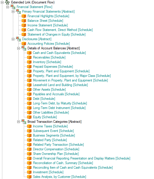
This is what amounts to a special meta pattern which articulates the flow as an organization of hypercubes with some "helper" abstract concepts to provide some hierarchy and therefore levels within the flow organization. All the line items marked "[Schedule]" are hypercubes in the XBRL taxonomy.
You want to change the flow? No worries. All you need to do is edit the XBRL taxonomy, changing the order of the hypercubes and you change the order of the way you look at the report.
So, that is what I call flow; it is simply the order that you want to see the information from an XBRL instance, articulated as a structure within an XBRL taxonomy. Change that flow by changing the taxonomy.
 Charlie
in Flow, Modeling Business Information Using XBRL, XBRL General Information
|
Charlie
in Flow, Modeling Business Information Using XBRL, XBRL General Information
|
 1 Comment
|
1 Comment
|  Email
|
Email
|  Print
Print
Notion of Shape
This blog entry builds upon this blog entry which articulates the idea of an interactive information hypercube.
If you look at this interactive information hypercube viewer, flipping through the different hypercubes listed on the left hand side, you will notice that the different hypercubes have different "shapes".
What I mean by shape is the dimensions which the hypercube uses. Look at the columns of each graphic and you will note that they are different.
If you look at, say, a financial statement, you will notice as I mentioned in the blog entry at the beginning of this blog entry, that statement can be broken down into a number of different hypercubes. Each of those hypercubes have different shapes. This is another way of saying that a financial statement could not be expressed by only one hypercube.
Another example will make this even more clear. Take a look at this Excel spreadsheet. (It is a ZIP file containing a spreadsheet actually) The spreadsheet is a collection of Excel pivot tables. There are two sheets for each pivot table. One sheet contains data for the pivot table, the other contains the actual pivot table. Each pivot table is equivalent to a hypercube. If you go through the different sheets you will begin to see that the dimensions of the information are different. It could be the case that a number of the columns are the same, but remember that another dimension at play here are the primary items or the line items of the hypercube. These are the rows of the spreadsheet.
You can see this even more clearly if you take a look at this example financial statement and then you compare that to this PDF which basically takes the pivot tables from the Excel sheet above and lays them out in the same order of the "paper" financial statement. The information is the same, the presentation is a little different as I tried to get the Excel pivot tables to represent the information from the financial statement as best as I could and as similar to the "paper" format as possible.
Again, the point here is that a financial statement is comprised of a number of hypercubes and those hypercubes have different shapes.
The next point which I will make is that of flow. I will go into that in my next blog entry.
Charlie
in Modeling Business Information Using XBRL, Shape, XBRL General Information
|
Post a Comment
| Email
| Print
Interactive Information Hypercube
I have been fiddling around with how to best use XBRL and have consolidated many, many, many other ideas into something that I am referring to as an "interactive information hypercube".
Breaking this down, this is what the notion of an interactive information hypercube is based on. Again, these really are not my base ideas, I am just combining many other ideas together in order to achieve something which I believe needs to be achieved. These ideas are:
- Interactive Information: The notion of interactive information comes from the term "interactive data" which was to the best of my knowledge coined by the US SEC. I believe that "information" is a more appropriate term than "data" in the context in which I am working.
- Hypercube: Ever since I started trying to understand XBRL Dimensions, I never really understood the difference between a cube and a hypercube. A couple of months ago I read something which clarified this, at least in my mind. Everyone can probably visualize what a cube is. A cube has three dimensions, it is a physical thing. Some business data has three or less dimensions which can be made to fit into the three physical dimensions of a cube. However, other business information has more than three dimensions which makes it difficult to visualize in the form of a cube. A hypercube is something which can represent any number of dimensions.
Now, you really have to stretch your imagination a bit with this graphic. But really take a look at the graphic. Imagine information expressed in that sort of form rather than on a piece of two dimensional paper! That is the idea. Clearly an application to view information would not look like that graphic; the point is that it does help one see the limitations of paper in communicating information.
This is a prototype "interactive information viewer" which I have been experimenting with during the process of creating XBRLS. The prototype takes what I had referred to as "neutral format tables" in XBRLS, modifies the tables slightly, and organizes the "99-Combined" XBRLS meta pattern (which is really a combination of all the XBRLS meta patterns into one XBRL taxonomy and XBRL instance to test the patterns). On the left, you can click on a hypercube from the XBRL taxonomy, and on the right a rendering of information relating to that hypercube is rendered in the form of a neutral format table. The prototype is simply PNG images from an Excel spreadsheet. The renderings were created manually in order to test the idea. The next step is to automatically create the rendering from information in the XBRL taxonomy and XBRL instance.
The prototype condenses down into an easier to work with set of hypercubes which you can view in this PDF. A better example of the use case I am experimenting to try and make work with is a financial statement. This PDF from the "comprehensive example"which I had created for XBRLS. The larger example looks more like a financial statement and is therefore easier to relate to. However, the XBRLS patterns in the 99-Combined example actually cover 100% of what is in the larger comprehensive example. That is the point of the XBRLS meta patterns...that small set of meta patterns can be used to express literally anything which I have come across in either financial reporting or other areas of business reporting from my experience with such information. Impossible you say? Well, isn't it interesting that the fundamental concepts of addition, subtraction, multiplication and division in mathematics works in the domains of physics, business, chemistry, engineering, etc. It is the simplicity of the meta patterns which offers the best evidence that they could be right. Time and experimentation will tell.
An earlier version of this comprehensive example included the following experiment. You can see the results of the experiment within this PDFwhich is similar to the PDF of the financial statement above enough to help you see the point I am about to make, but it is different (meaning, there is not a one to one correlation between the PDF files). The experiment was to express 100% of a financial statement within Excel pivot tables. I did that and "printed" screen shots of the pivot tables organized within a Word document.
The point is this: A financial statement is a collection of hypercubes.
What I want to do is go back and redo the XBRLS comprehensive example using the same form as the prototype interactive information hypercube viewer from above. That will be much easier for people to relate to and see that, in fact, (a) financial statements are collections of hypercubes and (b) that there are advantages to working with them as hypercubes, the primary benefit being that you can easily reorganize the financial information as you desire.
There are two things needed to make this work: an information model and a way to communicate flow.
XBRLS is the information model (at least one information model) which makes this work. The COREP taxonomy will likely work this way also.
Flow is simply a mechanism for organizing the individual hypercubes in an order that you want. That is actually easy to do, you can use an XBRL taxonomy to express flow. I will go into that later.
There is another advantage to the notion of an interactive information hypercube that I can see. Maybe I am right, maybe I am wrong. Today, there is no "multidimensional model". Each vendor implementing Business Intelligence (BI) software has their own model. Similar, but different enough to make like more complicated than it needs to be for business users. See "Getting Started with ADAPT". This BI solutions provider Symmetry Corp outlined the issue, its ramifications, and their solution for it in that white paper.
What if one multidimensional model could be created which all software vendors used? There is one SQL model. Not perfect, but significantly more consistent between software vendors than the multidimensional model. Who knows.
Charlie
in Comparing XBRL and XML, Modeling Business Information Using XBRL, XBRL General Information, XBRLS, interactive information hypercube
|
Post a Comment
| Email
| Print
Oracle's Enterprise Performance Management (EPM) System to Support XBRL
In a press release today, Oracle announced that their Enterprise Performance Management (EPM) System will support XBRL with help from UBmatrix. An excerpt from the press release states:
To help publicly held companies facilitate the preparation, publishing and automatic exchange of financial statements in XBRL (eXtensible Business Reporting Language), Oracle will embed UBmatrix, Inc.’s leading XBRL technology into Oracle's Enterprise Performance Management (EPM) System, Oracle announced today.
You can read the press release yourself. Here is a link to information on what SAP is doing with XBRL. Not to leave out the company I work for, UBmatrix who is providing XBRL components for both SAP and Oracle, see here for more info.
In a related story, Investor's Business Daily says:
Today, most software companies — including UBmatrix, Germany's SAP (SAP), Microsoft (MSFT) and Oracle (ORCL) — are starting to create XBRL software to help companies send financial data over the Web.
I would probably add IBM to the list of companies who are creating XBRL software to help companies send financial (and other businessdata) over the Web. IBM is pushing XBRL as a standard for risk reporting as you can see from this Web page and this Web page. They are probably moving slowly but deliberately as they figure out how to best integrate XBRL into their offerings.
(If anyone knows specifically what IBM and Microsoft are doing, love to hear know that, maybe you could post a comment on this blog.)
Charlie
in General Information, IBM, Oracle, SAP, XBRL General Information
|
Post a Comment
| Email
| Print
XBRL Instance Graphic
The following is a graphic of an XBRL instance which, I believe, helps people visualize the connection between the "tags" and a "printed" business report be it on paper, in PDF or HTML, etc.
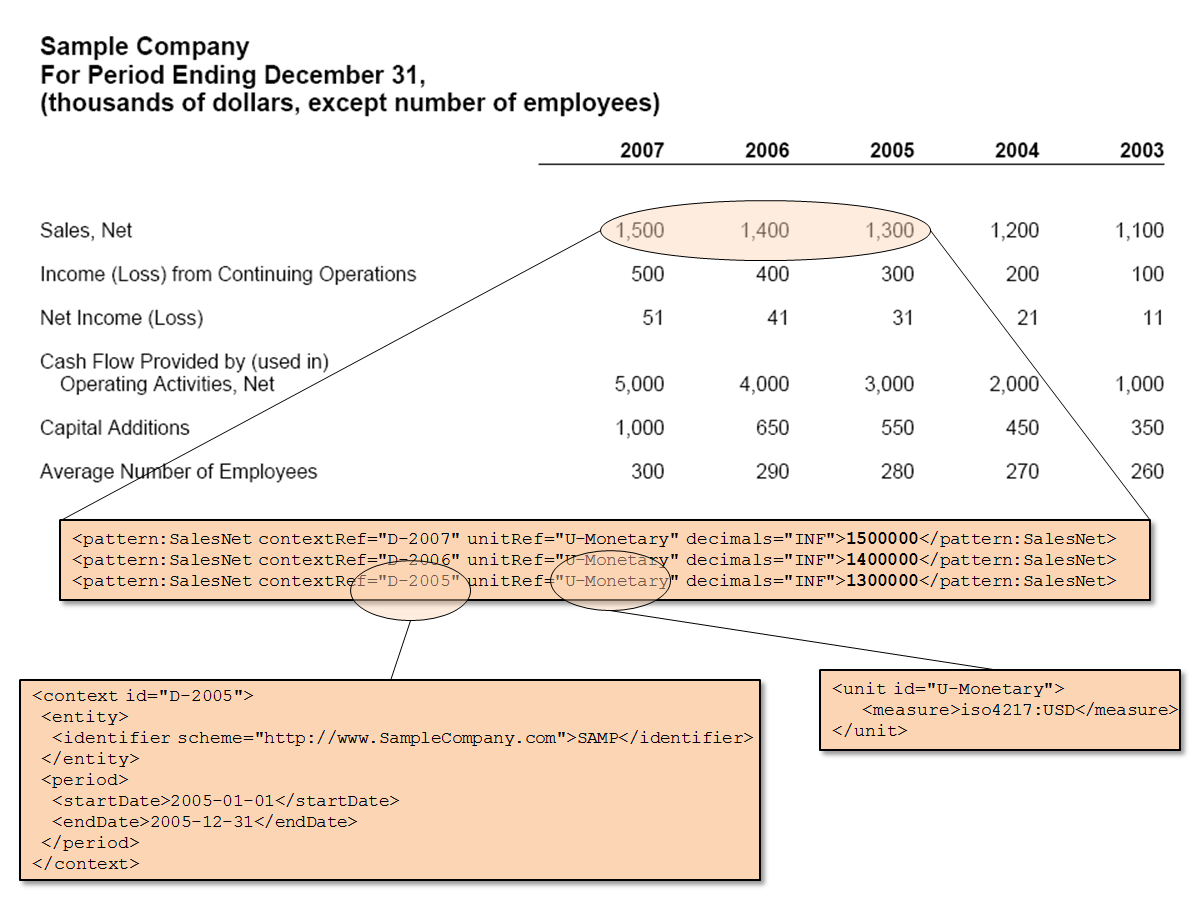 XBRL Instance GraphicOne could go on, and on, and on with this; connecting the concept to the XBRL taxonomy, the taxonomy concept to resources and relations. Wouldn't it be great if software applications did this for you! Would help visualizing the information, finding errors, etc. Clearly you would not want to see the tags, but rather interfaces that show the information contained within the tags.
Charlie
in XBRL General Information, XBRL Instance Graphic
|
1 Comment
| Email
| Print

