BLOG: Digital Financial Reporting
This is a blog for information relating to digital financial reporting. This blog is basically my "lab notebook" for experimenting and learning about XBRL-based digital financial reporting. This is my brain storming platform. This is where I think out loud (i.e. publicly) about digital financial reporting. This information is for innovators and early adopters who are ushering in a new era of accounting, reporting, auditing, and analysis in a digital environment.
Much of the information contained in this blog is synthasized, summarized, condensed, better organized and articulated in my book XBRL for Dummies and in the chapters of Intelligent XBRL-based Digital Financial Reporting. If you have any questions, feel free to contact me.
Entries from November 30, 2014 - December 6, 2014
Public Input on the Establishment of Financial Data Standards
This is a link to public input provided to Treasury related to the establishment of financial data standards. Treasury is required to implement these standards as part of The Data Act which was passed earlier this year by the US Congress and signed by the president. The Data Transparency Coalition played a major role in getting this legislation enacted as law.
This video is of a hearing of the House Committee on Oversight and Government Reform, a discussion about implementing The DATA Act. It is worth watching. The video helps one understand how tax payers will benefit from enacting this law.
Part 1:
Part 2:
Be sure to read my public input! Use the first link above to get to the list of comments.
 Charlie
in Digital Financial Reporting
|
Charlie
in Digital Financial Reporting
|
 Post a Comment
|
Post a Comment
|  Email
|
Email
|  Print
Print
Digital Business Report: Cross Between Spreadsheet, Pivot Table, and BI
This blog post is another attempt to communicate how a digital financial report will work. This is a prior attempt. This update uses information from this blog post also.
A hypercube is table which can have any number of dimensions, or "n" dimensions. A cube has three dimensions. A tesseract has four dimensions. The more dimensions you have, the wilder the visuals get.
While the number of dimensions can be larger than two dimensions; a spreadsheet is limited to visualizing only two physical dimensions at a time because of the limitations of physical space: columns and rows which intersect at a "cell". But imagine a spreadsheet which can do this:

To understand how visualizing information that has more than two dimensions might work; one must first decompose the information into its components.
First off, the term dimension is a technical term used to represent a characteristic of a piece of information for unambiguous interpretation. A dimension is technical approach to articulating a characteristic.
A characteristic (or distinguishing aspect) provides information necessary to describe a fact or distinguish one fact from another fact. A fact may have one or many distinguishing characteristics.
A scalar is a piece of information which has no characteristics, it stands on its own. A scalar does not need to be characterized. For example, the value of pi is a scalar, it never changes; it always has the same value for everyone. (Pi is the ratio of a circle's circumference to its diameter and always has the value of equal to 3.14)
Visually, this is what a scalar looks like:

A list has only one physical dimension. For example, the following is a list of numbers. But you don't know any more about the characteristics of the number. You don't know if the number is for, say, revenue, net income, assets; you don't know if the number is in US Dollars, Euros, or Yen; you don't know if the number is for Microsoft, Apple, IBM, or some other company. All you have is a list of numbers:

A table has two physical dimensions: rows and columns which intersect to form cells. A spreadsheet is a good example of presenting a table. Other terms used for table are matrix and array.

A table (spreadsheet, matrix, array) can have any number of rows and columns (or, to the limit of the software application; Excel for example does have limits).
So a table can hold pretty much any set of information and the characteristics which describe the information. But as the number of characteristics, rows, and columns increases; it gets harder and harder to work with the information. Also, if you are working with DIFFERENT tables which have different dimensions/characteristics things get more challenging.
This is why relational databases are so handy. Relational databases store information in the form of tables which can basically hold anything. But as the shapes of the tables change, it gets more and more challenging to put things into relational databases or manage all the things you have in a relational database. As new tables are received, the relational database schema needs to be changed.
Here is a small table with a value and four characteristics which conceptualize the value in the column "Fact Value" or "Fact". A fact is equivalent to a cell. A fact defines a single, observable, reportable piece of information contained within a business report, or fact value, contextualized for unambiguous interpretation or analysis by one or more distinguishing characteristics:

A cube can be thought of as a three dimensional presentation of a table/matrix/array. "Space" has three dimensions. Paper only has two dimensions though. You can present three dimensional information on the two dimensional medium of paper by grouping information and printing one group, then the next, then the next linearly down the piece of paper. The software application Excel achieves three dimensions by adding the notion of a "sheet". In the old days of spreadsheets there was only one sheet. But today, Excel has the notion of a "workbook" which contains "sheets" which then contain rows and columns which intersect and form cells.

A pivot table is an approach to visualizing a table of information which has more than two dimensions. There are two things going on with pivot tables. The first is the number of characteristics a value has and the second is how to show all of the information, including the characteristics, in usable ways. So you have both the information that you are dealing with and how to present the information. Again, a computer screen only has two dimensions, it is flat. It can be a challenge to render information which has more than two dimensions in a two dimensional space. A pivot table is one way of achieving that goal.

As was said above, a hypercube is an "n" dimensional table/matrix/array. Where "n" represents any number of dimensions or characteristics. And so every table is a hypercube. Different tables or hypercubes can have different numbers of characteristics. It is easy to work with tables that have exactly the same characteristics or dimensions together. The more different the dimensions/characteristics, the more challenging it is to put different tables/hypercubes together.
Saying this another way, different tables/hypercubes have different shapes.
The more dimensions or characteristics that a hypercube has, the more challenging it is to rendering that information in two dimensional space such as paper or a spreadsheet. Computers can be better for presenting this sort of information to humans in readable forms because computers can be dynamic, like a pivot table.
In today's spreadsheets, the cells of the intersections of the rows and columns of a spreadsheet are created by the physical rows and columns. Rows and columns are basically numbered. But what if the rows and columns were connected together not by physical rows and columns, but by meaning. What if the characteristics of the information glued cells together into rows and columns?
This is mental leap, but image the cells laid out flat (graphic below), but then a software program grabs the appropriate information based on the relations between the cells; grabs the appropriate business rules based on the type of concept arrangement patterns (roll up, versus roll forward, versus adjustment, versus hierarchy), member arrangement patterns (whole-part relations such as member-collection); grabs information related to common approaches to rendering and formatting information; and then put all of those pieces together to provide a human-readable rendering.
And so, you go from something that looks like this:
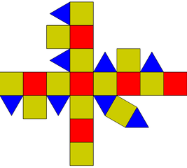 http://en.wikipedia.org/wiki/RhombicuboctahedronTo something that looks like this using all of that metadata:
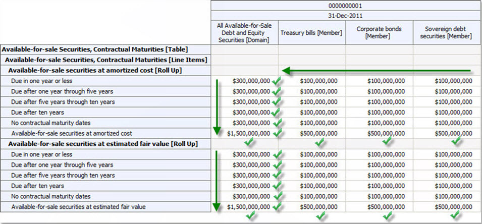 (Click image for larger view)You can show, or not show, the green checks if the roll ups actually roll up. If they don't roll up, you show red X's or something.
But you not only get great human readable renderings, you also get to pivot the renderings to render information the way you want it shown and formatted without rekeying the information into a different spreadsheet. As you pivot information, the renderings are always readable by humans because the pivot table understands the difference between a roll up and a roll forward. You can drag and drop spreadsheets to compare information from separate documents such as separate financial reports.
Imagine an application which is good at handling n-dimensional information (i.e. any number of dimensions or characteristics). Consider this visualization of a four dimensional object or hypercube:
Or this visualization of a five dimensional hypercube:
A pivot table is one example of that sort of application. Image an electronic spreadsheet/pivot table type application which:
- Is a global standard (such as XBRL)
- Hypercubes can be edited by business users
- Supports common computations including roll ups, roll forwards, adjustments, variances
- Information is glued together with business rules and the business rules are just as exchangeable as the information itself (i.e. the metadata is part of the information)
- Information is exchangeable between any business system (not limited to your internal silos of information)
- Supports OLAP, but does not require OLAP to be used
- Supports both numeric and textual information
- The pivot tables are read/write
- Is easy to query because the metadata used to glue the information together is understood by the query engine
No such software exists today with all of these features. However, each of these features does exist. The SEC Interactive Data Viewer renders a lot of information nicely; but it is actually not that great of a rendering engine and the renderings are not pivotable, they are not dynamic. The XBRL Cloud Viewer (click on "Viewer" in the Interactive Reviewer column) renderings are pretty good and they are dynamic; but they are read only. Neither of these let you perform the simple task of querying across filings, but the SECXBRL.info API will let you do that. Other applications exist which have some of the above features; but no application exists with all of these features.
But what if the application did exist? What if the application had a high reasoning capacity because it interacted with the metadata appropriately.
What if you added an additional layer on top of that application which was specific to financial reports. Then, the digital business report because a digital financial report, simply by adding another layer of metadata. Basically, there are three layers:
- XBRL processor: handles the technical syntax layer, makes sure the syntax conforms to the XBRL technical specification.
- Business report processor: handles the business report layer; makes sure the model structure is intact, makes sure that roll ups actually roll up, roll forwards acually roll forward, other things that all digital business reports have in common.
- Financial report processor: If the business report is also a financial report, another layer exists to make sure the report conforms to the rules of a financial report; the fundamental accounting concepts are intact; the report frame is intact; the disclosure checklist is complied with; all this is done by leveraging financial report specific metadata.
What exactly prevents this application from being created?
FIBO is a Sign of Things to Come
FIBO (Financial Industry Business Ontology) is being created by the EDM Council (Enterprise Data Management Council) which seems to be part of OMG(Object Management Group) or has some sort of tight association with OMG.
FIBO is doing something that is really interesting. Their documentation is excellent. It is understandable to business people and technical people. It is extremely well organized. The visualizations are excellent. This is some of the best documentation of metadata that I have seen.
Perhaps I will adopt that model as a good way to express the information in the Financial Report Ontology (FRO). My stuff is scattered. Visual views, lists all over the place, wikis, other important stuff. I need to get this stuff better organized.
The sign of things to come is business people dealing with metadata, ontologies included. Why? Enables machines to do things only humans could have done in the past.
#############################################
I was subsequently made aware of the Financial Industry Regulatory Ontology (FIRO)
Charlie
in Becoming an XBRL Master Craftsman
|
Post a Comment
| Email
| Print
New Approach of Testing Public Company Conformance to Fundamental Accounting Concepts and Results
I have been testing conformance to a set of fundamental accounting concepts using the same approach for almost a year now. These blog posts summarize those results:
- March 3, 2014: One set of fundamental concepts, working prototype
- September 22, 2014: One set of fundamental concepts, commercial product
- October 19, 2014: One set of fundamental concepts, commercial product
- November 1, 2014: One set of fundamental concepts, commercial product
I now have a new approach. The prior approach used one set of fundamental accounting concepts and relations between those concepts for all entities. The new approach groups entities into currently 81 groups and provides a set of fundamental accounting concepts and relations between those concepts. Why? Because that is what the data says.
What are the 81 groups? The groups come from the following reality based on how 6,943 entities report:
- Entities have different accounting/industry activities
- Commercial and industrial (5,985)
- Interest based revenues (632)
- Insurance based revenues (50)
- Securities based revenues (93)
- Real estate investment trust (158)
- Utility (25)
- Entities use different balance sheet formats
- Classified balance sheet (5,527)
- Unclassified balance sheet (1,412)
- Liquidity based balance sheet (4)
- Entities roll up net cash flow on their cash flow statement differently
- Exchange gains (losses) part of net cash flow or does not report line item (6,845)
- Exchange gains (losses) part of cash roll forward (98)
- Entities use different income statement formats
- Single step income statement (4,255)
- Multi step income statement (2,688)
- Entities report Income (loss) from equity method investments in different locations on their income statement
- Income (loss) from equity method investments not reported (5,290)
- Income (loss) from equity method investments reported BEFORE tax (1,402)
- Income (loss) from equity method investments reported AFTER tax (113)
- Income (loss) from equity method investments reported within nonoperating income (loss) (122)
- Income (loss) from equity method investments reported within revenues (16)
- Income (loss) from equity method investments reported between income (loss) from continuing operations before and after taxes (0, not working yet)
- Some entities report operating income (loss) as a line item while others don't
- Operating income (loss) reported (5,120)
- Operating income (loss) not reported (1,823)
These may not be totally correct yet...but they will be eventually. Probably soon. The amazing thing is that when I switched from the single set to the multi-set or what I call a report frame based approach, I did not break anything as far as I can tell. This is how the data sorts out now by generator:
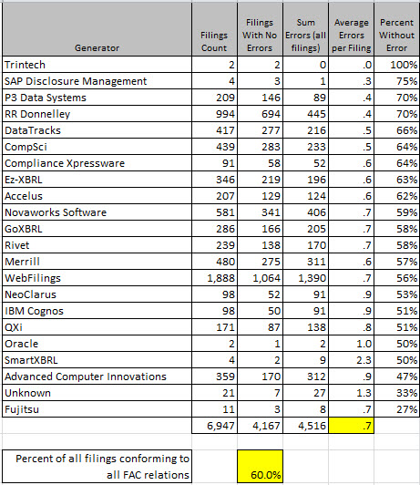 (Click image for larger view)
So, the last results I provides showed that 63.1% of entities passed all conformance tests, that dropped to 60.0%. I don't think that is because quality is going backwards, it is because my testing is getting better based on feedback I am receiving.
There is another thing that I want to point out. The total number of nonconforming items is 4,516. I would break that down as follows:
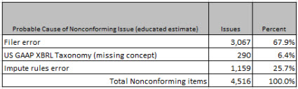
Most issues can be proven to be filer error, 67.9% approximately. 290 or so appear to be cause by missing US GAAP XBRL Taxonomy concepts. And the remaining 1,159 are likely caused by bugs or errors that I still have in my process (in the mapping rules or in the impute rules, this is still a work in process). So basically the point is that why filers don't conform can be explained.
I also want to point out this to put things into perspective. If you look at the two graphics below you can see that while 4,516 nonconforming items exist you will also note that by one measure 349,781 conforming items exist and by another measure 141,371 conforming items exist:
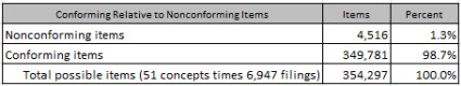
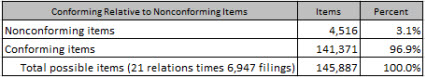
So basically, somewhere between 96.9% and 98.7% of all fundamental accounting concept relations are conformed to and 60% of all reporting entities conform to 100% of these relations currently.
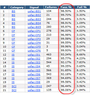
And there is one final graphic I want to show you. This is the summary of conforming/nonconforming items as shown from the commercial software product that I am using to evaluate public company financial statements against these fundamental accounting concept relations:
I realize that this is a lot of information. When people talk to me I commonly get the feedback that they feel like they have a 4 and 1/2 inch fire hose shoved into their mouth. So here is information that you can read about that puts all these pieces together for you. Read it at your own pace.
Trust me, this is important information. But while this is important to understand, stay tuned to understand what it all means.
Oh, almost forgot. Here is the comparison of the analysis periods.
Charlie
in Becoming an XBRL Master Craftsman
|
Post a Comment
| Email
| Print

