Understanding Why Many SEC XBRL Financial Filing Disclosures are Hard to Read
Every wonder why disclosures within SEC XBRL financial filings are hard to read? This document, Understanding Why Many SEC XBRL Financial Filing Disclosures are Hard to Read, walks you through some examples and shows you why.
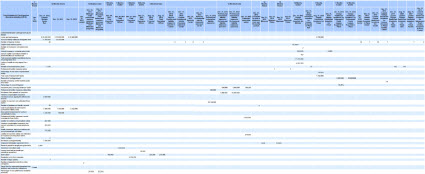
This is one of the worse disclosures that I have run across:
If you look at that disclosure you see a number of things. First, you see white space. White space is a clear sign of a bad representation. Second, you can see groups of information. Really look at the small image. Can you see the groups of numbers. Each of those groups likely represents one disclosure. I see about 10 individual disclosures which were packed together.
These are the cliff notes which can be used to create useful disclosures:
- Don't create disclosures based on how information is presented in the HTML financials, represent the information based on logical disclsoures.
- Don't mix modeling approaches together.
- If you have a lot of empty cells or "white space", something is likely represented incorrectly.


Reader Comments