BLOG: Digital Financial Reporting
This is a blog for information relating to digital financial reporting. This blog is basically my "lab notebook" for experimenting and learning about XBRL-based digital financial reporting. This is my brain storming platform. This is where I think out loud (i.e. publicly) about digital financial reporting. This information is for innovators and early adopters who are ushering in a new era of accounting, reporting, auditing, and analysis in a digital environment.
Much of the information contained in this blog is synthasized, summarized, condensed, better organized and articulated in my book XBRL for Dummies and in the chapters of Intelligent XBRL-based Digital Financial Reporting. If you have any questions, feel free to contact me.
Entries from July 6, 2014 - July 12, 2014
Signs of the Transparency to Come to Financial Reporting
Many people pushing XBRL as a digital financial reporting format point to transparency as one of the benefits of leveraging that technology. Well, you can get a glimpse of what they are talking about today. Admittedly there is a ways to go, but the path has been set and we are rapidly moving down that path.
These are some visualizations and this is an accounting tool which I created using information obtained about SEC XBRL financial filings using off-the-shelf software provided by UBmatrix (Taxonomy Designer, XBRL Processor), XBRL Cloud (Edgar Report Information API), 28msec (SECXBRL.info API), Tableau (Tableau Public), and Microsoft (Access, Excel).
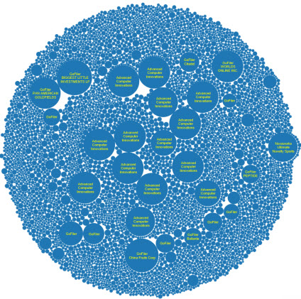 (Click to go to visualization)
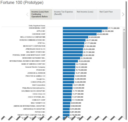
The visualization above are for report element extension and errors. This visualization shows Fortune 100 information(prototype). I am pulling information which I extracted from the SEC XBRL financial filing. If the filer reported it wrong or made me guess, reported information may show up in this visualization incorrectly. Personally, I don't think using this information should be or needs to be a guessing game.
 (Click image to view visualization)
So, people who want to get at this information can get the information. But, there are three pieces left as I see it:
- Improve quality. The quality of SEC XBRL financial filings needs to improve and they will. Transparency will help detect and correct errors. Something like this digital disclosure checklist will help reduce errors. The more business rules, the more which can be automated. Automating as much information verification is the key to information quality.
- Eliminate guessing game. Using this information should be safe, predictable, reliable, repeatable. Software vendors should not need to spend untold hours unraveling this information. That is costly and causes the system to be brittle. This information should be easy for a machine to interpret.
- Make things easier for business users. Admittedly I have a deep, deep knowledge of the moving pieces and am very fortunate to understand both the financial reporting aspects and the technology aspects at work. For that I am grateful to all those who have helped me over the past 15 years. But building these pieces needs to be easier for business users who have less knowledge, particularly technical knowledge.
This document, Digital Financial Reporting Principles, is my best effort at collecting and organizing information which can be used to improve quality, eliminate the guessing game, and making things easier for business users.
Think about the sorts of things you can see from these examples and from other software products and services which leverage the XBRL-based financial information mandated that public companies report to the SEC. Project from what you see to other possibilities. These are only a few examples.
While US financial reporting is on the leading edge of digital financial reporting, think of other domains where these same technologies and techniques can be applied. Think of other products which will likely be created by the market.
Don't let people fool you into thinking that all this is hard and has to be complex. It doesn't. Beat down complexity. If I can do this, others can do this also. If what you have been trying seems hard or complex, try something different.
Two quotes from Albert Einstein:
Insanity: doing the same thing over and over again and expecting different results.
Any fool can make things bigger, more complex, and more violent. It takes a touch of genius-and a lot of courage-to move in the opposite direction.
Simple is the ultimate sophistication. Simple is elegant.
The above examples will give you an idea of the level of transparency which is on the way. Empowering business users to employ these sorts of technologies and techniques is valuable.
 Charlie
in Demonstrations of Using XBRL
|
Charlie
in Demonstrations of Using XBRL
|
 Post a Comment
|
Post a Comment
|  Email
|
Email
|  Print
Print
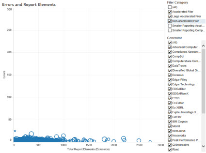
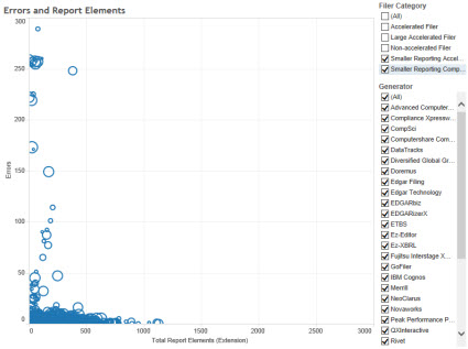
Comparison of Errors and Extension Report Elements
Man, this is incredibly interesting and useful stuff. This visualization "Errors and Report Elements" tab or "Dashboard 2" shows Errors on the vertical axis and the number of extension report elements on the horizontal axis. The two screen shots below are for LARGER and SMALLER reporting entities. You can select which groups you want to see. The really interesting thing is to look by Generator!
This is a visualization of errors and extension concepts for larger entities: (fewer errors, more extension report elements)
 (Click to go to visualization)
This is a visualization of errors and extension concepts for smaller entities: (more errors, fewer extension report elements)
 (Click to go to visualization)
Reach your own conclusions.
Visual Comparison of Extensions at Report Element Category Level
The SEC is complaining about extensions. Just looking at the total number of extension elements only tells part of the story. For example, the company who created the most extension report elements, Realty Income Corp, had 4,399 extensions, but 4,123 of them where [Member]s. Those [Member]s seem perfectly reasonable to me. (You can go to their filing here, look at the second to the last schedule in the Notes Detail)
So, one really needs to understand which category of report element is being extended. This visualization which I created shows that detail.
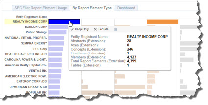 (Click to go to Tableau Visualization)
Here is the raw data in Excel.
Isn't Tableau useful? I think so. Slice, dice, sort, search, filter to your hearts content. Find anything interesting be sure to let me know.
Charlie
in Becoming an XBRL Master Craftsman
|
Post a Comment
| Email
| Print
Dynamic Tableau Chart from SEC XBRL Financial Information
Yesterday I prototyped a Tableau visualization which was fed by a prototype dynamic OData web service feed. Last night, one of the developers at 28msec created a prototype OData output format from their SECXBRL.info web service API. They took this query, and converted this XML format of that query into OData which Tableau supports, and you get this Tableau dashboard:
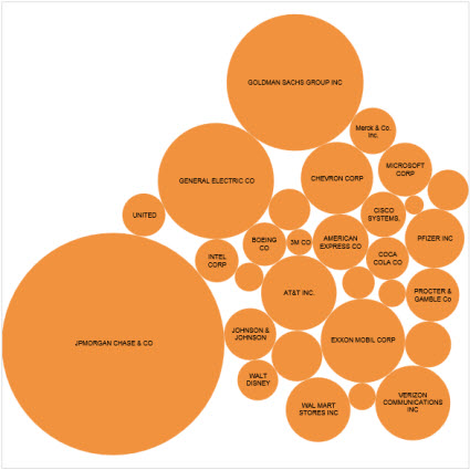 (Click image to visit dashboard)
This is awesome, awesome, awesome. Why? An SEC filer can submit a report in XBRL and a query like this would be dynamically updated as a result, feed this visualization, and the visualization is adjusted for the new information. Any business user can create something like this by copying and pasting a URL into Tableau or editing a pretty basic URL.
So, this is up and running on the SECXBRL.info test server which I have access to but cannot make that available publicly. But, I speculate that I can lobby 28msec to get this in their development cycle and they could have this working in a week or two.
To see how this work work, go to this query page, create whatever query you want, and then go to the upper right hand corner and press the "EXPORT" button. Select the XML format and look at the URL. How easy is that!
Charlie
in Demonstrations of Using XBRL
|
Post a Comment
| Email
| Print
Another Tableau Prototype
So I was wrong about something in my prior post about Tableau.
In that post I said that Tableau reads your information and puts it into their database. What I meant was that they did not support dynamic data feeds, such as a REST URI. Well, I talked to Tableau, they explained how to hook to a dynamic data feed, and sure enough. Below is a prototype of a dynamic data feed!
I created another Tableau visualization prototype. This one is for revenues for the DOW 30. I could not get the embedded object to work in my blog page, but I did get it to work in a stand-alone page. Click on the image below to get to that:
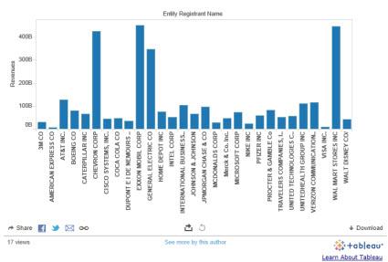 (Click to go to imbedded visualization)
Now, what is REALLY interesting is this: OData. What I did was take this query from SECXBRL.info, transformed the XML from SECXBRL.info to OData. The OData is directly importable into Tableau Public! What does that mean? Live data feed populates the chart!!!
I am not quite there, but here is the deal. If a filer submits a new filing, the chart would update. SECXBRL.info reads the SEC database and updates their system, my system reads the SECXBRL.info system and generates the OData file, Tableau reads my OData file, chart refreshes!
Now, I have to get my system out of the loop. How? Convince SECXBRL.info to serialize OData for me.
Stay tuned!
Here is a Tableau Story that I created.
This is the same story, tuned up a bit and embedded within an HTML page.
Charlie
in Demonstrations of Using XBRL
|
Post a Comment
| Email
| Print

